

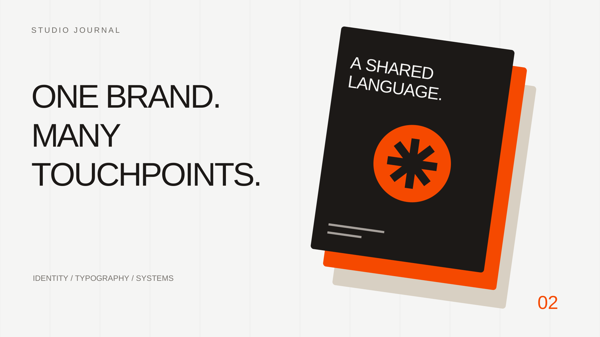
A logo is often the most recognizable part of a visual identity. It is also only one part of the experience. People encounter a business through its website, proposals, packaging, social posts and everyday messages.
Consistency comes from the way those pieces relate to one another.
Build a small set of useful rules
A practical identity system answers everyday questions. Which logo version belongs on a dark background? Which typeface is used for a heading? How much space should surround the mark?
The aim is to make common decisions easier for the people producing the work.
Useful foundations include:
- A defined color palette with clear roles for each color.
- A type hierarchy for headings, body copy and small labels.
- Logo versions suited to light and dark backgrounds.
- A recognizable approach to photography or illustration.
- A few examples of the language the business uses.
Give colors a job
A palette is easier to apply when its colors have a purpose. An accent might highlight important actions. A neutral background can give content room to breathe. Text colors need to remain readable in the contexts where they are used.
These roles create continuity without requiring every page or post to look identical.
Match the language to the visuals
A playful identity can feel disconnected if every sentence reads like a formal contract. A precise, professional service can feel unclear if its messaging relies on vague slogans.
Write a few examples: an introduction, a service description, a short announcement and a response to an enquiry. These examples help the team understand the intended voice in real situations.
Test the system in everyday work
Apply the identity to things the business actually needs. A website header, a presentation cover, a business card and a social post can reveal different constraints.
A design that works at one size may need a simpler version elsewhere. That adaptation can still feel like the same brand when its underlying choices remain connected.
Keep the working files easy to find
Even a thoughtful identity becomes difficult to use when assets are scattered across old folders and message threads. Keep current logo files, approved colors and useful templates in a shared location.
Consistency is maintained through everyday use. Clear guidance and accessible files help the next piece of work feel connected to the last.
Conversation 0
No published comments yet. Start the conversation.
Leave a comment
Your email stays private. Comments are reviewed before publication.